The home of architecture and design in Asia-Pacific
Get the latest design news direct to your inbox!
Get the latest design news direct to your inbox!
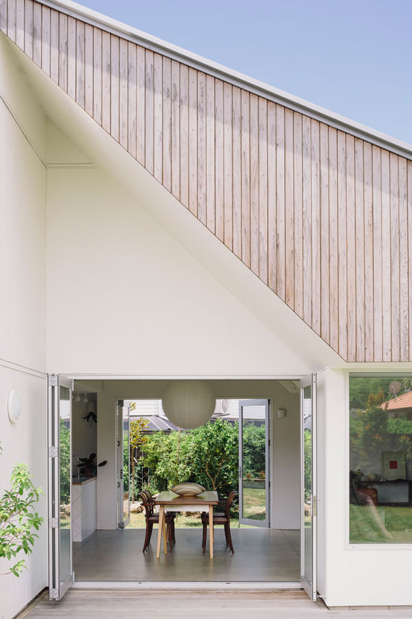
Despite constraints of a tight section and an even tighter budget, architect Henri Sayes sought to create a unique house for himself and his wife in the midst of bland suburbia.

May 5th, 2015
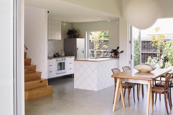
With the intention to use the limited budget as a springboard rather than a restriction, the house was designed as a simple barn-like shell. Spatial complexity has been created through hanging, inverted trusses that demarcate the open plan, double height living and dining space.
The kitchen sits alongside the dining area, tucked under the mezzanine upper floor. “You want it to have good light, you want it to be a space that feels good to be in,” Henri says. “I’m not interested in designing a kitchen that is trying to be the centre of attention. You want the kitchen to be somewhere people gravitate to without it screaming.” The kitchen is the first part of the house you see; the view from the front door is of the tiled island, so it plays with that idea of both being subtle but also blatant.
Indeed, opposites is a theme that runs through this kitchen. The back bench has been detailed like a sideboard – being on legs it doesn’t feel permanent; in contrast the front bench is tiled in and permanent.
The tight 70m2 floor plate of the house’s ground floor has meant the small kitchen needed to be clever with space. “With small kitchens you break things down to their bare minimum; there’s a tightness about them which makes them more straightforward in some ways. In other ways, though, it can be a battle to fit all the appliances and storage and benchspace into a limited area without compromising functionality,” he explains.
Part of this difficulty comes from the two stage nature of kitchen design. “The kitchen is one of those things where you set it out pretty early but you don’t design it in detail until quite late,” explains Henri. Only once the bigger architectural gestures have been considered, confirmed and even constructed, does the designer turn to the detail of the kitchen. In working out the overall house layout, the kitchen was set our rudimentarily with two benches making galley-like space; this created spatial parameters when Henri started to design the kitchen’s cabinetry and focused his attention on trying to create a sense of generosity and usefulness within the small area.
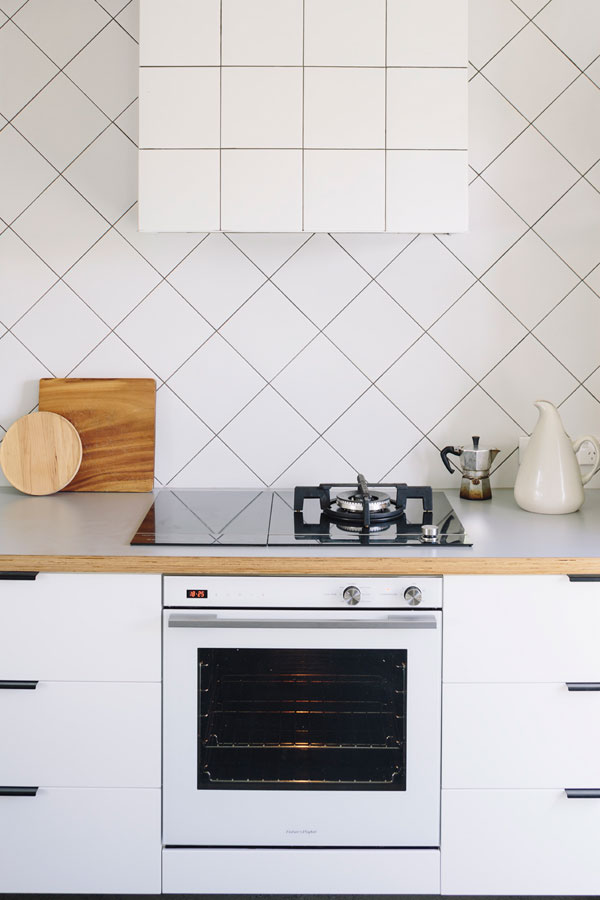
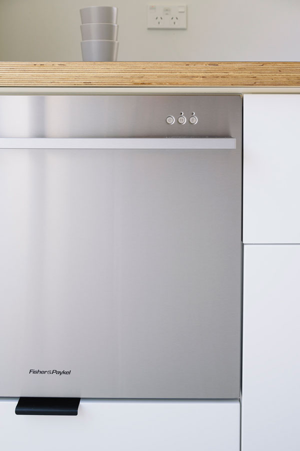
“You’re jostling, always pushing and pulling space, always trying to distribute it to where it needs to be,” he explains. Flexibility in appliances helped the architect fit as much as possible into the small space. The DishDrawer Tall is the ideal size for the couple, and its compact form means they were able to fit a drawer underneath for all that awkward plastic-ware storage. In a similar way, not having the room for a large cooktop but wanting both gas and induction, Fisher & Paykel’s combination cooktops allowed them to place a gas burner that can be configured for a wok, a pan or even a single serve moka pot, next to a two-burner induction cooktop. Those two induction zones can also be bridged into a single zone ideal for long or large pots.
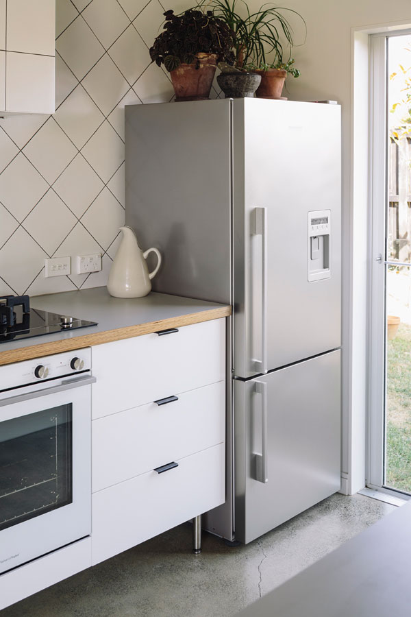
Henri chose to focus on underbench drawers that would provide the best utility, and avoid upper cabinets that would have created a division between the kitchen and living space and made the space feel tighter and more cluttered. In line with this, rather that designing tall cabinetry to house the fridge, Henri made the most of the smooth side of the Fisher & Paykel fridge and chose to leave this exposed and slide the fridge into a space left between the wall and the back bench. This continues the effect almost moveable, light and temporary feel of the back bench.
Henri expanded the kitchen by exploiting the space under the stair that ran alongside the kitchen, creating a narrow but ample pantry that became a large gesture when he designed an oversized pegboard slider to hide the pantry when not in use. “The space was just there, and it just made sense. Over time it changed and became a larger gesture.”
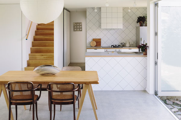
The colour palette of this kitchen keeps to white and black, but plays up different patterns and textures. The pegboard slider has been painted white with the perforations showing as dark dots. The white cabinetry is inset with tongue-like handles that were custom black chromed. The peninsula benchtop and the back wall are tiled with white square tiles laid in a diamond pattern; the pattern reverts to rectilinear when the tiles run over the rangehood. “While you are always thinking about how the kitchen relates as a space and about the relationships between the sink and where you prep and where you cook and where you serve people and hang out, but a lot of it comes down to pure aesthetics with kitchens,” Henri admits. “They’re generally a trick. And I suppose our trick was playing with the pattern of the tiles.”
For more Fisher & Paykel case studies, please visit thekitchentools.fisherpaykel.com.
Fisher & Paykel
fisherpaykel.com
A searchable and comprehensive guide for specifying leading products and their suppliers
Keep up to date with the latest and greatest from our industry BFF's!
The internet never sleeps! Here's the stuff you might have missed