The home of architecture and design in Asia-Pacific
Get the latest design news direct to your inbox!
Get the latest design news direct to your inbox!
Moroso turned up the dial on colour and pattern to the max this year during Milan Design Week with the creations of inimitable British designer Bethan Laura Wood.
April 27th, 2018
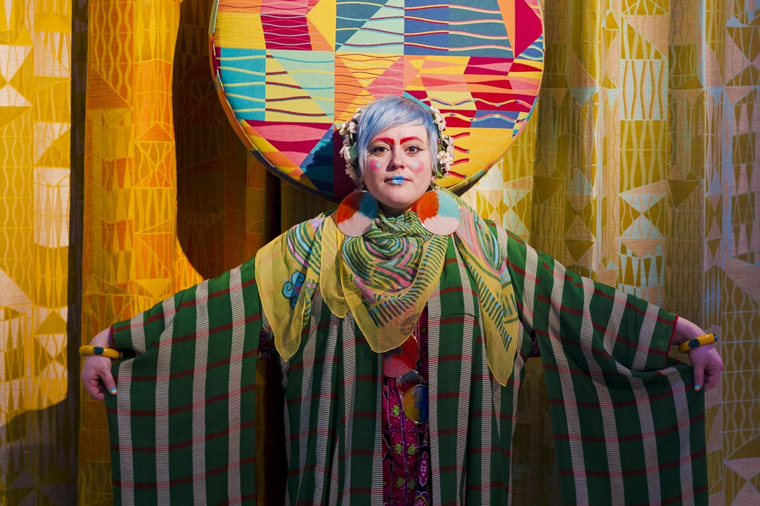
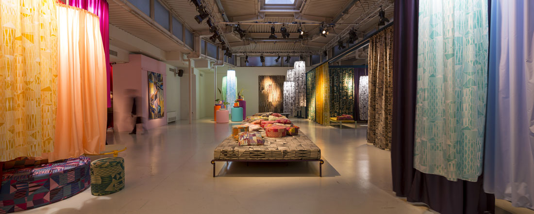
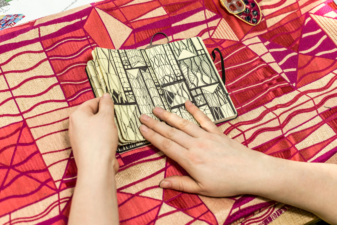
Moroso’s Milan showroom was both a riot of colour and pattern and an oasis for contemplation during Design Week this year. Multidisciplinary designer Bethan Laura Wood presented a collection of jacquard fabrics, prints, carpets, tapestries, vases and furniture derived from her fascination with the colourful windows at Mexico City’s new Basilica of Our Lady of Guadalupe.
Wood collects ‘public patterns’ from the environments she experiences through walking and exploring. Her sensorial experience at the Mexican Basilica soon turned into an obsession that led, with Moroso, textile company Limonta and rug maker Golran, to a series of artworks, textiles and carpets referencing the art of embroidery in traditional Mexican Otomi fabrics.
They were presented – along with a small collection of furniture for Moroso – in a colour-rich installation at the brand’s showroom, attracting a great deal of fascination. We caught up with Wood in the space.
What do you hope that this installation will communicate to visitors?
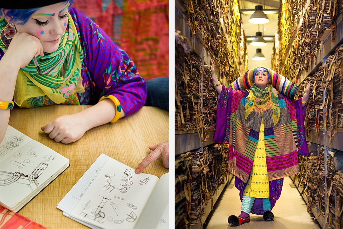
Well, I hope joy. On the opening night, it was great. There were so many little people just going nuts on the central day beds, making pillow mountains. When we came in today, there were people just having a break and chilling out in there.
There are a lot overlaps in the installation: visual, aural, and in terms of the colour and pattern. What does that say about how you want visitors to digest or experience the show?
Colour is very accessible to a lot of people. I really enjoy the immediacy – how colour brings out a reaction, good or bad. People can relate to so many different colour combinations. The installation shows different layers of the design process – from the very first drawing experiments where I was trying out different ways of interpreting the pattern and shapes. It shows the way things are translated – from the raw information and inspiration, through the layers, to finally get to the technical fabrics.
Could you tell me about the breadth of your practice?
My practice is multidisciplinary. I’ve always been interested in being free to go from one scale to another, from one material to another, and to allow the right question, or the right answer, to lead the project. For example, when I first went to Mexico in 2013, that’s when I saw the new Basilica of Our Lady of Guadalupe. I knew that was something I definitely was going to work with, but at the time I didn’t have the right project. I knew it needed to be a textile, or a flat pattern.
Do you think that narrative in design is more important, or more evident, these days than in the past?
Most projects have some narrative aspect. There’s been more openness to that being a way of engaging people with the work. Everything is very fast paced now. We receive a lot of information all of the time. So, I think, sometimes, being given the full story, or a longer story that helps you come into a whole world, can hold people’s attention.
I understand that the production of these textiles explored a crossover between handicraft and mass production. Could you explain what that means in technical terms?
Patrizia Moroso is great at understanding craft and beautiful handiworks, but then finding ways to make them in a mass-produced way that doesn’t lose that soul, that character. There’s a particular type of embroidery from the south of Mexico that’s done by all the ladies there. This was one of the key references I was using when I was drawing inspiration from the windows, and breaking it into a pattern. Then I worked with an artist to create a one-off applique piece. I was really excited to find a way with Patrizia to take that spirit, but then re-work with it with Limonta into a woven jacquard.
There can be surprises in the translation. After they wove some of the fabrics, I started to understand how the weft and the warp work together to bring dominance to one colour over another. For me, that is one of the really exciting things you get with woven fabrics. The yarns behave so differently depending on the type of weaves you use, but also what you weave them with. One type of thread, or one colour, can be the dominant one, but if you put a different partner with it that can become the dominant colour. It totally changes. It’s crazy. Colour is not static. It’s a temperamental little minx.
In Singapore, Moroso is available at Xtra.
A searchable and comprehensive guide for specifying leading products and their suppliers
Keep up to date with the latest and greatest from our industry BFF's!
The internet never sleeps! Here's the stuff you might have missed