The home of architecture and design in Asia-Pacific
Get the latest design news direct to your inbox!
Get the latest design news direct to your inbox!
We travelled to Denmark with Montana to celebrate the launch of 30 new colours invented to balance a life saturated by blue light emitted by screens and inject personality into spaces.

June 28th, 2019
‘What’s your favourite colour?’ might be a simple question to answer when we were little. The answer to this question might change as we get older. For many (and myself included) the answer to that question today is: ‘Depends.’ Some colours work more than others depending on the occasion, usage, combination, time-of-day, our state-of-mind, and a myriad of other factors. And when it comes to designing colours, few can reach Danish furniture brand Montana’s level of expertise.
Last month, Indesign Media Asia had the pleasure of travelling with Montana to Odense and Copenhagen, Denmark, to celebrate the launch of its new palette, which welcomed 30 new colours.
Founded in 1981 in Odense, the birthplace of beloved storyteller Hans Christian Andersen on the island of Funen, Montana has become one of the most well-known Danish furniture brands worldwide for its immensely versatile signature modular storage system ( a recent case in point is a design competition in Singapore organised in collaboration with P5 Studio). And for its colour offering – an anomaly in the colour-shy Nordic region.
Montana develops a new colour palette every eight years. The latest palette was unveiled during 3daysofdesign – Denmark’s annual design event that sees Copenhagen celebrating design with a variety of different programmes (and major international design talents) for three days – at Montana’s showroom and store.
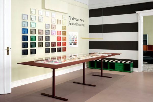
The new palette comprises 40 new colours– 30 of which are new ones and 10 retained from the previous palette – and two wood veneers. And it asks you not to “judge a colour by its colour”, but by how it relates to us and its surroundings.
The 30 new colours in the palette were designed by Margrethe Odgaard, a Copenhagen-based colour and textile designer and a self-professed “colour nerd”. The 30 colours explore how colours relate to one another, our bodies, and their spatial context.
“We wanted to create a palette of colours that is nourishing to your body,” said Odgaard at the launch event. No colour is an island, she said; the colours in the palette have been curated to complement each other.
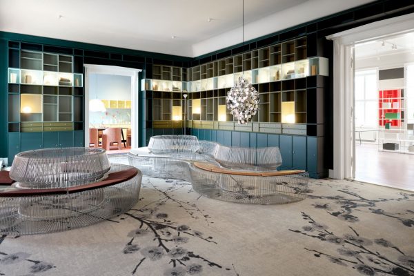
Some are designed to grab your attention, like Monarch, a proud deep blue that coats the ornate staircase that welcomes visitors to Montana’s showroom.
Some are designed to be, in Odgaard’s words, “easy to live with”, like Oat, Oyster and Truffle, a trio of beige shades whose pinkish, bluish and reddish undertone will come out when paired with certain shade, and reinforce the colour temperature of a space.

The white, black and greys from the palette are multi-dimensional, they are composed of many other colours and similarly will reveal different undertone depending on its surroundings.
This concept was demonstrated in the showroom, which was decked as an apartment complete with dining, living, sleeping and working areas. The showroom was designed by Helena Laursen, Architect & Head of Spatial Design at Montana. Laursen was responsible for Montana’s award-winning colourful presentations at Salone del Mobile Milano.
“If you think of the universe, you think of the dark vast blue, and humankind has always sought nourishment and warmth around fire – the orange and brown protecting us against the blue,” said Odgaard of her observation on our lives today that inspired her to create the palette.”Today, much of the stress in our lives comes from the blue light emitted by screens. So I would like colours that nourish our bodies and relieve some of this stress.”
These colours are designed to pair well with architectural materials, reinforcing the ‘warm’ ones like timber and terracotta to softening ‘cold’ ones like glass, steel and concrete. It took Montana and Odgaard over a year to develop the 30 colours in collaboration with AkzoNobel in Sweden. And incidentally, the only yellow in the palette, Chamomile, was the hardest to create according to Odgaard.
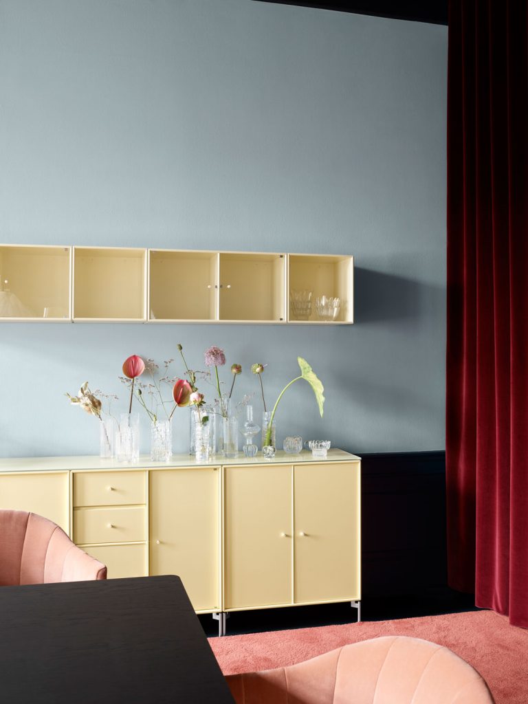
“Yellow can be a stressful colour. It grabs your attention and always looking to signal something – a sale, a warning. I wanted to create a yellow that is soft and leaving just enough impression that the sun has kissed this surface and left,” she shared. “If I had one regret in this collection, it’s not naming this colour Sun Kissed,” she added.
A searchable and comprehensive guide for specifying leading products and their suppliers
Keep up to date with the latest and greatest from our industry BFF's!
The internet never sleeps! Here's the stuff you might have missed