The home of architecture and design in Asia-Pacific
Get the latest design news direct to your inbox!
Get the latest design news direct to your inbox!
Luo Jingmei reports on the new Graphic Design Poster Collection curated by Kult.

July 23rd, 2014
For the launch of the product collaboration between Kapok and Industry+, Kult has curated a series of limited posters by ten of the most exciting names in the Singaporean graphic design community today. Ranging from emerging to established talents, each designer has utilised his or her unique skill set and design vocabulary to interpret the theme of ‘Asian Subconscious’.
Drawing their influences from Asian architecture, typography, packaging and food, the artists express undercurrents of contemporary Asian culture in their designs. Featured creatives and collectives include Foreign Policy Design, Mojoko, Anonymous, Jonathan Yuen, Djohan Johari, LSD, Where You Going, Ryan Len, Masafa and Somewhere Else.
The graphic design poster collection was unveiled as part of Singapore Design Week at the National Design Centre (NDC), and is available for sale in limited edition high quality prints at SGD100 each at the Kapok pop-up shop at NDC and online at store.kultmagazine.com.sg.
Here, the designers explain their work:
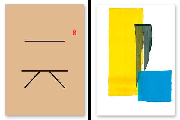
From left: Work by Jonathan Yuen and Masafa
Jonathan Yuen
whererootsare.com
I referenced the famous British culture poster ‘Keep Calm and Carry On’, and attempted to translate it into two pictographs. The pictography process is how the Chinese used to describe visual things or mental concepts, which eventually evolved into corresponding logogram words to describe them. Here I deduced ‘Keep Calm’ with a stroke like still water, and ‘Carry On’ with an unhindered road that goes on into the far horizon. As a result, the pictographs looks like ‘one new Chinese word’. “Just Do It”.
Masafa
masaf.at
The black stroke represents an ‘alif’, the first letter of the Arabic alphabet which has deep roots in Singapore’s history. The two colour blocks were the result of experimenting with new processes in mark making – these processes and techniques, we hope, can provide us with new understanding and appreciation of abstract, modernist approaches and their history in Singapore and abroad.
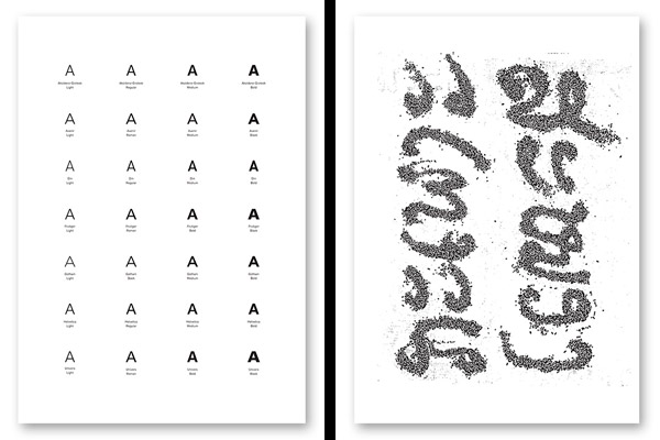
From left: Work by Anonymous and LSD
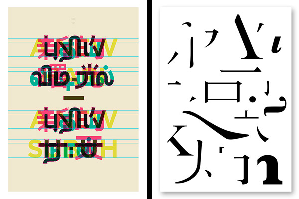
Anonymous
anonymous.com.sg
One of the most common misconceptions formed of Asians is that we all look the same. A is for Asian is a cheeky interpretation that draws parallels between the stereotype that all Asians look the same with another common misconception that all sans serif fonts look the same.
The Lao script for ‘brain’ and ‘stomach’ is written with black sticky rice, the symbol of food in Laos. The stomach is the ‘second brain’, especially in Asia.
From left: Work by Ryan Len and Somewhere Else
Ryan Len
ryanlen.com
The typographic poster embraces Asia’s diversity by drawing influences from different elements of architecture found across the region to form the word ‘亚洲’, which means ‘Asia’ in Mandarin.
Somewhere Else
somewhereelse.com
The mandarin characters mean ‘homesick’. We want to allude to the current sentiment a lot of us have: we miss the home we used to have… with rapid modernisation, there is a sense that we are losing our identity.
From left: Work by Where You Going and Foreign Policy Design
Where You Going
whereyougoing.asia
Made from elements of three existing alphabets (comprising four languages: Chinese, English, Malay, and Tamil), these new characters are familiar yet alien, suggestive of future possibilities.
Foreign Policy Design
foreignpolicydesign.com
Deconstructed strokes of Chinese characters and Latin letters are used to express our view of Asian integration and disintegration with the Western world.
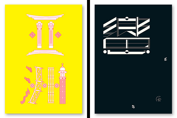
Djohan Johari (top image, left)
bloodthrone.co
The process in this project involves finding the lowest common denominator of different races, in this case, romanticising the trades of those who labored in a time before an era of accelerated urban development.
Mojoko (top image, right)
mojoko.net
Based on packaging for Chinese medicine, this piece incorporates society’s obsession with food. It’s a visual juxtaposition of eastern and western culture.
A searchable and comprehensive guide for specifying leading products and their suppliers
Keep up to date with the latest and greatest from our industry BFF's!
The internet never sleeps! Here's the stuff you might have missed