The home of architecture and design in Asia-Pacific
Get the latest design news direct to your inbox!
Get the latest design news direct to your inbox!
In Cubes Indesign C65, we featured Formwerk Architects’ dynamic Diamond House. Here in Cubes Extras, the architecture firm’s similar manipulation of light and space results in a gentle re-interpretation of the traditional shophouse typology. Luo Jingmei reports.
December 30th, 2013
Formwerkz Architects is known for creating unpredictable, yet logical and comfortable spaces for their residential houses throughout Singapore. Here in an office project, it is no different.
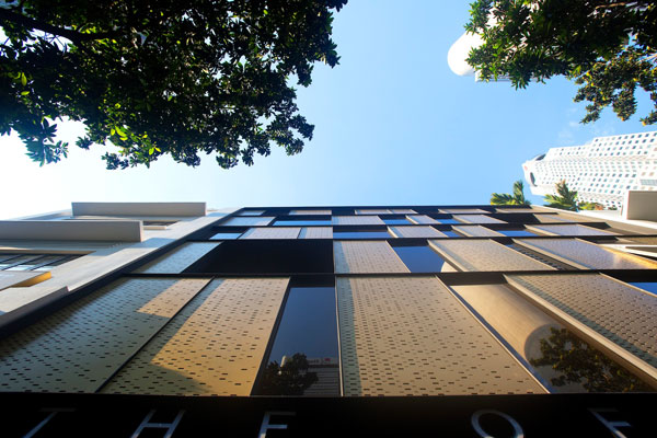
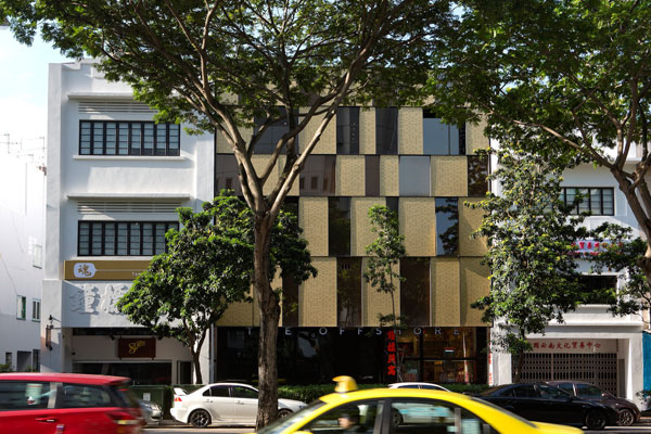
The modular matrix on the facade is inspired by the gunny sacks commonly used in rice warehouses
The client wanted a design that integrated the three shophouse units (one existing and conserved, and the other two new erections), but that would also allow for adaptability of multiple F&B and retail tenants and the potential breakaway of one of the new units.
The matrix pattern on the front facade is echoed in the back facade in more subdued shades and plaster and paint finish
From the front, the development looks more like two, rather than three individual units. The conserved one sits at the corner, regal and whitewashed. The other two are defined by a matrix facade of black and gold perforated panels, inspired by the conserved unit’s previous life as a rice warehouse. Yet, the latter respects that of the old, drawing from it in the manipulation of its scale and proportions. For example, the horizontal datum line of the adjacent conserved shophouses guides the new facade.
“One of the key design challenges was devising a formal strategy that unifies the joint development while differentiating the new-built from the conserved shophouse,” says Tay, one of the firm’s partners and the architect-in-charge. “The new elements are articulated with lightness in contrast to the [solidarity] of the traditional masonry shophouse of the conserved part.”
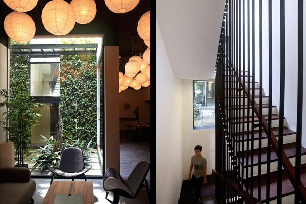
(Left) The sushi bar on the second storey looks into the courtyard of the fashion retail store; (right) The courtyard windows of the staircase offers glimpses of the shops at the different floors
Inside, Tay has also worked to unify the spaces in a delightful manner. “The typical configuration of a traditional shophouse only privileges the ground floor units for retail and F&B uses. For the upper floors to be viable as well, we had to make these spaces more accessible from the street and less vertically stratified.”
The solution was the positioning of the lift lobby and main entrance at the rear, accessed from the side lane next to the conserved unit. With the service spine connecting all the tenanted spaces tucked away, Tay could be more creative with the main staircase adjoining the two new units.
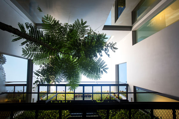
Units looking into the courtyard are privy to views of green and sky
Alongside this staircase is a courtyard from the second storey upward, open to the sky. Light, natural ventilation and green relief is introduced, while the tenants, potentially divorced from one another, could become more engaged. “As opposed to the light well of the traditional shophouse typology, this courtyard space is highly public, enabling the main staircase to become an extension of the street linking the units on the upper floors,” describes Tay.
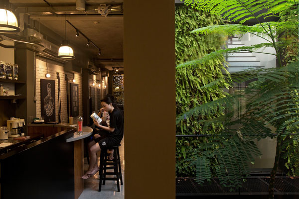
The lush courtyard brings to the gym on the third storey an unexpected punch of nature
Randomly displaced windows, creating a lively rhythm, look into the courtyard from the sushi bar, fashion retail unit, gym and bar in the second, third and attic levels. While serving to reduce the over-looking issue between the units, this manoeuvre also frames the individual shop activities for the users going up and down the adjoining staircase.
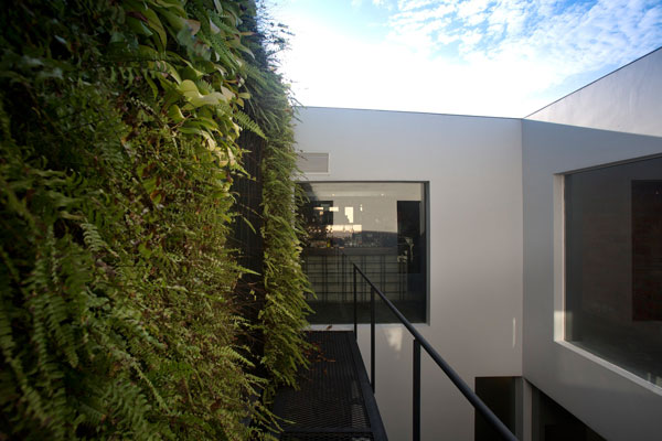
A soothing view from the attic bar’s entrance
Designing within or alongside the traditional shophouse typology is no easy feat. Many solutions end up in pure replication or vulgar interventions with no regard for context. Here, with a few subtle but clever and sensitive considerations, Formwerkz Architects has created a series of spaces that tread a nice balance between old and new, beauty and functionality.
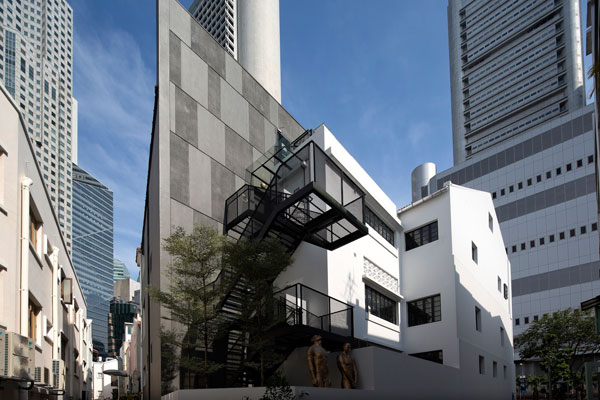
Top image: The scale and proportions of the new unit (middle) respects that of the conserved unit (left)
A searchable and comprehensive guide for specifying leading products and their suppliers
Keep up to date with the latest and greatest from our industry BFF's!
The internet never sleeps! Here's the stuff you might have missed