The home of architecture and design in Asia-Pacific
Get the latest design news direct to your inbox!
Get the latest design news direct to your inbox!
Architect Lee May Anne of Makk Architects shared with us some of her ideas and methodologies in Cubes Indesign C64. Here, a brief view into one of her projects. Story by Luo Jingmei.

October 25th, 2013
Brick is a masonry material known for its compressive strength. If following the adage ‘form following function’, it is meant to appear as solid walls, structures tied to the ground. In the reconstruction of a house, architect Lee May Anne has turned this perception on its head. Brick is a highlight on the facade as a fluid skin that meanders from the first storey surface, then under the soffit as if defying gravity, then up to the second storey as a screen wall.
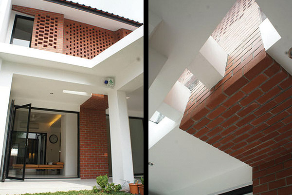
These articulations, Lee shares, were inspired by nature. “A weaving in and out was done to get a more three-dimensional look to the very flat facade, to create the look of a ‘voluminous’ tree canopy. The bricks are conceptualised to ‘grow’ like a tree with the trunk, starting from the inter-locking brick screen, forming the facade. The gaps are akin to the sporadic gaps formed by the foliage of a tree.”
The difficulty lay in getting them to effortlessly ‘float’ as they turn horizontal, says Lee. “To hold its own weight going horizontal under the slab is a little challenging. I didn’t want a fake brick [tile] that looks different in terms of colour and dimensions, hence steel rods are inserted through the entire stretch to cantilever them internally and give the appearance of the ‘creeping’ up effect, and hence, the lightness.”
Practical concerns are also addressed with this skin. It filters out light from car headlights into the second floor where the bedrooms are, which was a concern of the client – a couple with young children. “On the other hand, as part of the design language, I wanted to give a rustic feel to the house, thinking that the existing bricks at the party wall can be chiselled to save some cost,” Lee adds. “However, during construction, we realised that the existing bricks were laid in mixed direction and looked untidy. Hence, we dropped the chiselled brick idea and went with a properly plastered surface. But the lightness of the brick was the key idea and the brick screening was maintained.”
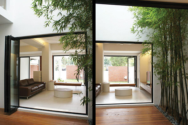
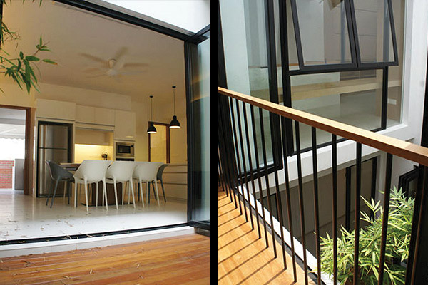
In the end, the white plaster balances the brick with a modernity. This clean language also continues into the simple plan: living, dining and kitchen area on the first floor, and bedrooms on the second. Meanwhile, a courtyard on the first floor opens up the inter-terrace house to light and natural ventilation. Here, the master bedroom also “has a view [across to the other bedrooms and downwards]… hence, having the ‘visual control’ of who is in and what is happening in the house,” says Lee.
In the end, here is a simple home that provides the necessary comforts of privacy, shade, and natural elements. It is pleasant in eschewing the oftentimes-disproportionate monstrous scale and much-too-glassy facades that small houses are prone to these days.
A searchable and comprehensive guide for specifying leading products and their suppliers
Keep up to date with the latest and greatest from our industry BFF's!
The internet never sleeps! Here's the stuff you might have missed