The home of architecture and design in Asia-Pacific
Get the latest design news direct to your inbox!
Get the latest design news direct to your inbox!
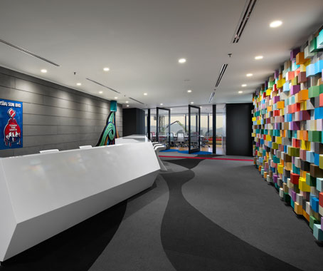
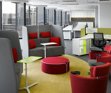
Bright splashes of colour and playful, informal arrangements characterise Sherwin-Williams’ Kuala Lumpur office.
March 20th, 2013
The design concept for Sherwin-Williams’ APAC Finance Shared Service Center on the 28th level of Vista Tower in Kuala Lumpur, Malaysia is inspired by the company’s core product – paint.
“Colour is often only used as an aesthetic component, which mainly means it is used to complement the architecture. With Sherwin-Williams, it defines the element of design as well as the fundamental nature of Sherwin-Williams and their business,” says Ramesh Subramaniam, one of the lead designers for this project at M Moser.

The office of the US paint manufacturer is a blanket of colour. The ’pop out’ feature wall in the reception area – which extends into the pantry – displays the company’s products with each ’box’ covered in a shade from Sherwin-Williams’ paint catalogue.

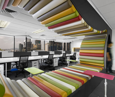
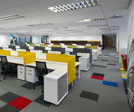
Angular walls help suggest a sense of movement through the work zones while the workstations themselves are playfully laid out. “Instead of the usual arrangement in ranks or even clustering the workstations around the columns, we went a bit unconventional and dispersed them at different angles,” says Christine Teoh, the other lead designer for this project. In addition, the collaborative areas are scattered across the office to encourage greater interaction.
Colour extends to the Haworth workstations, with each work cluster identified by a different colour.
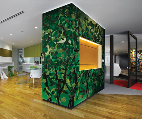
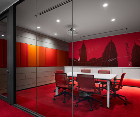
The two meetings rooms, suitably named The Blue Room and The Red Room, are covered in vibrant graphics featuring landmarks in both Malaysia and Cleveland (the US city where Sherwin-Williams’ headquarters is located)
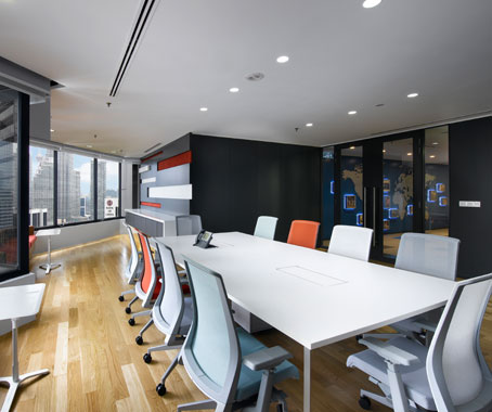
And to allow staff and visitors to enjoy the views around the office, glass walls and pivot doors have been heavily employed.

M Moser is now working on Sherwin-Williams’ office expansion on level 29, which continues the same design philosophy and theme.
M Moser
mmoser.com
A searchable and comprehensive guide for specifying leading products and their suppliers
Keep up to date with the latest and greatest from our industry BFF's!
The internet never sleeps! Here's the stuff you might have missed